Color in clothes and its meaning
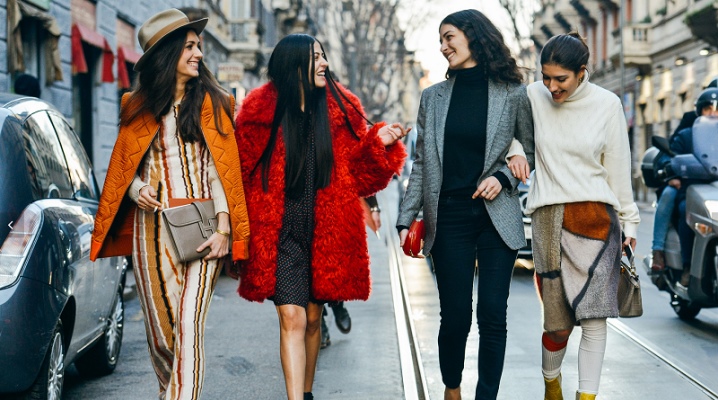
There is still no complete idea of what is the mechanism of the influence of color on a person's mood. However, none of the psychologists denies the existence of such a fact. Given that we are surrounded by a space filled with color, choosing its shade can mean a choice of mood for a person, including in clothes.
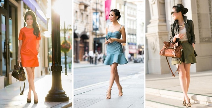

Color Meaning
We rack our brains almost every morning deciding what to wear. We choose the color of clothes depending on the mood, how we feel or how we want to present ourselves on this particular day.


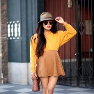
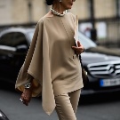
But in order to understand which colors to choose, you need to know how a certain shade affects us. When a woman says that she feels like a “bluestocking”, this may mean that she is depressed and sad for some objective reason, but it can also mean that the color blue really provokes a person to feel sad.
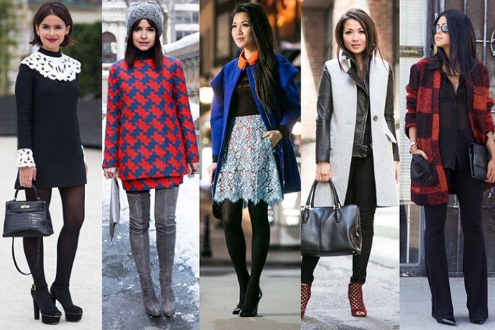


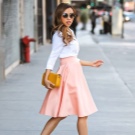

Colors are divided into warm, cold and neutral. They all affect our mood, so the choice is important.




The first scientist who began to study this issue was Isaac Newton, who invented the color wheel and the basic principles of color theory. He collected all the colors visible in nature into a single complex and placed it inside the circle.Modern designers also use this discovery, creating attractive and interesting palettes using the color wheel.



According to his theory, blue, blue, green and purple, as well as most of their derivatives, are classified as cold colors, also called shades of winter.
It is believed that cold colors have a relaxing effect on a person.
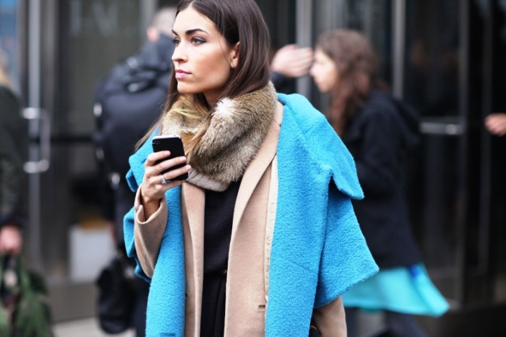
Warm colors, or shades of summer, include everything that reminds of the sun: orange, red and yellow. It is believed that warm colors affect the human psyche in a stimulating way.
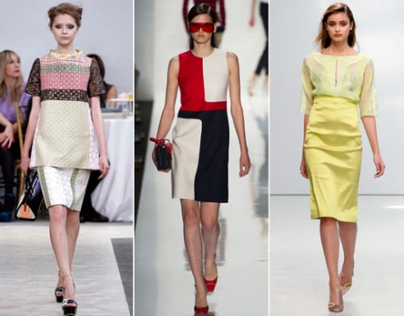
The exceptions are black, white and gray, which are called basic or neutral.
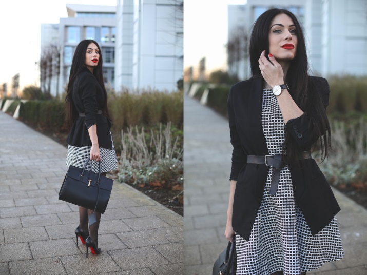
Black is the complete absence of color. And white consists of the entire visible part of the electromagnetic spectrum - red, orange, yellow, green, blue, indigo and violet, collected in equal proportions.
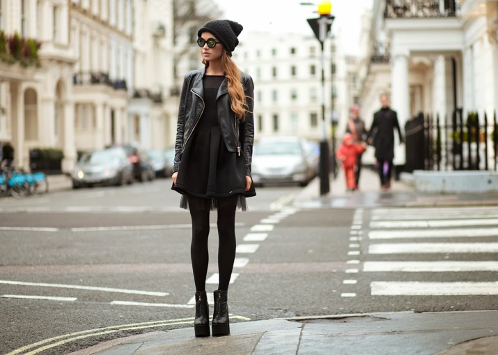
Classic Medium Gray is a neutral color used to set dark and light points in art and design. Adding more white than black to the mixture produces a gray tone that is lighter than medium gray. By adding more black, you can get a gray color that is darker than medium gray.
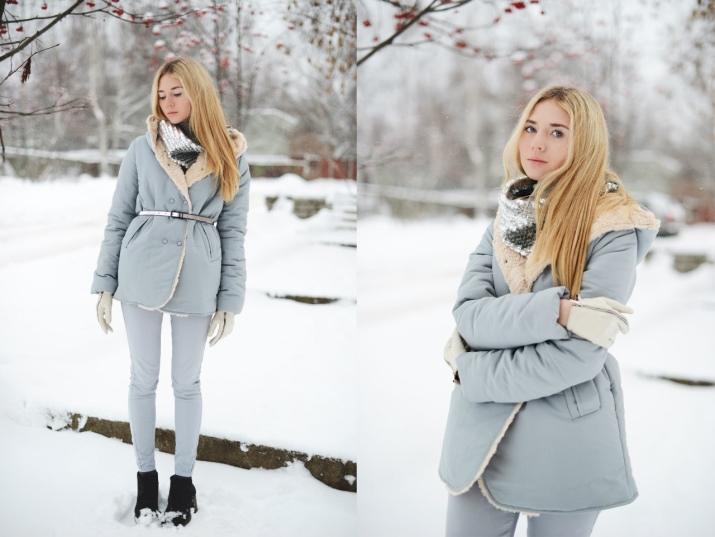
The influence of the main colors of the spectrum on the human psyche has been known for a long time.
- Red is a strong, hot color that evokes powerful emotions of passion, sex, energy, blood and war.
- Yellow is a cheerful and energetic color, it means happiness, sunshine and other light and playful feelings.
- Orange It is also a bright and warm color. It symbolizes fire, sun, fun, warmth and tropical images.
- Green - is the color of nature and health, it symbolizes growth, development, fertility and security.
- Blue is a cold and soothing color, the color of the sky and the sea, the color of constancy, strength, wisdom and trust.
- Violet symbolizes mystery, magic, power and luxury.
- Black often used to depict something evil, it is oppressive, frightening and even the color of death in the traditional sense of modern man.
- White often associated with pure, fresh and positive. The color of fresh snow, which evokes tender and pleasant images in people who grew up in the traditions of Western civilization.
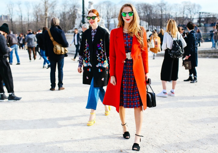

But these basic colors are not limited to the bright and diverse world around us. There are other options for color shades, many of which are in the fusion of cold and warm tones.
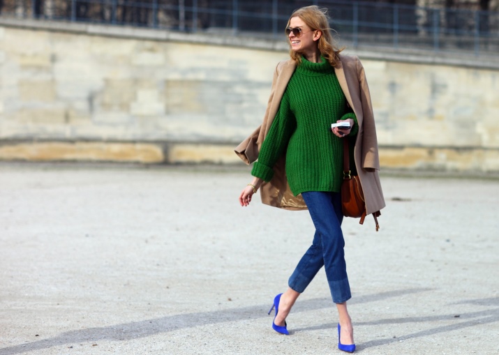
Using them in clothes will allow you to attract additional attention to yourself, make a bold statement or create a mood.
Cowberry
This color is also commonly called cranberry, it belongs to the cold range. It is a dark shade of red-violet, which is considered universal. It is not as bright as red, so it acts more delicately and softer.
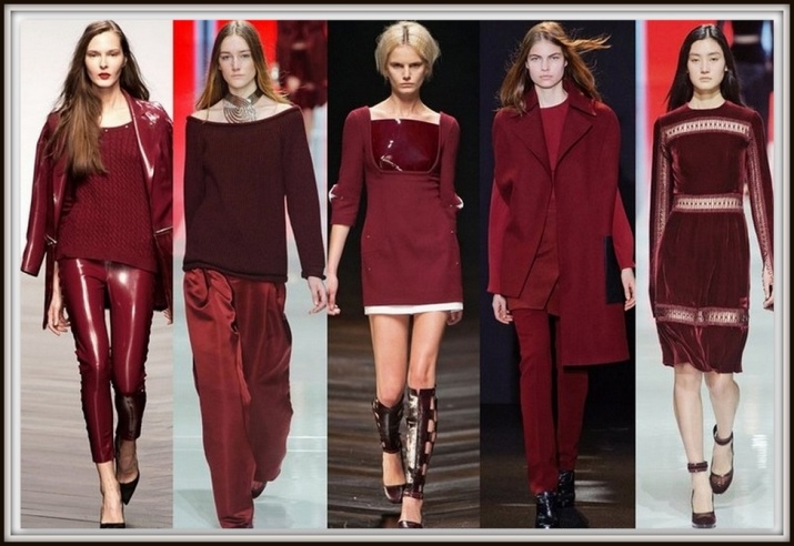
The predominance of lingonberry in clothes is associated with chic and evening out, this color gives elegance even to office clothes.
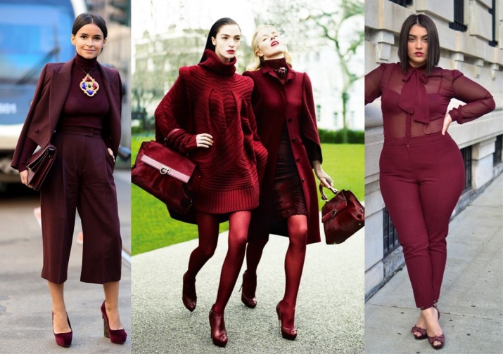
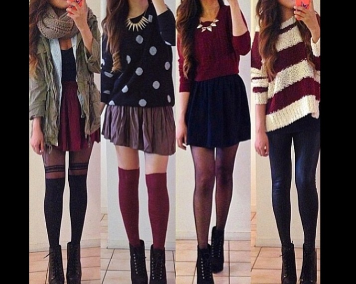
It can be worn all year round and is well accentuated in black, gray and white. In clothes, it is combined with beige, brown, blue, green and turquoise.
Amethyst
This cold color is a shade of purple, but more vibrant and dynamic. It is generally accepted in society that smart and spiritual people like it.
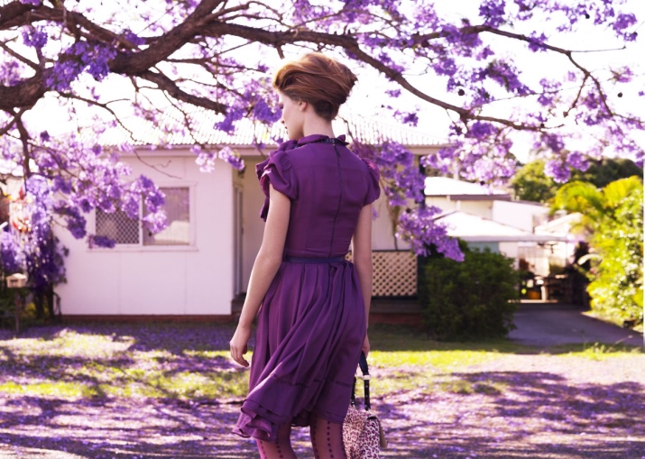
This color is self-sufficient, in an amethyst dress the girl will be the center of attention at any party.
You can carefully combine it with golden or classic yellow and milky shades.Mixes of amethyst with blue-green or turquoise look elegant.
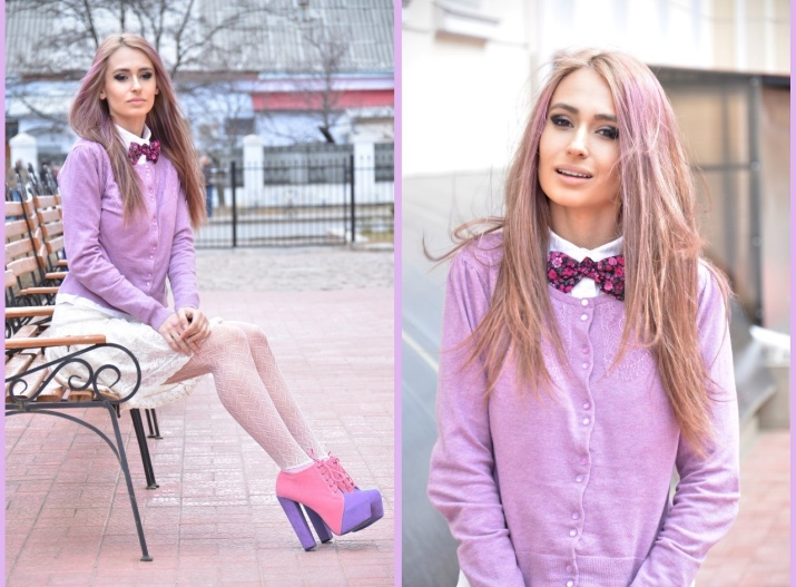
Cyclamen
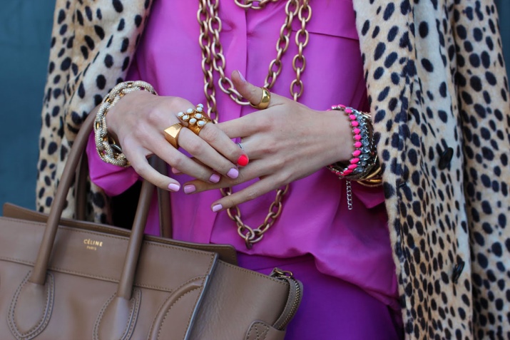
The color called cyclamen is a very bright version of pink with a cool purple undertone. There are several modifications of this color, it can be brighter or paler, but always remains expressive and spectacular. This is a catchy and bold color, which is usually attributed to the neon group. The girl who puts it on becomes bright and expressive, she attracts glances, makes a candy-sweet impression.
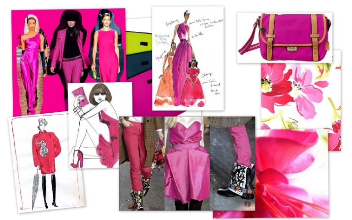
Cyclamen does not like competition. The background for this juicy shade can be calm neutral tones, such as brown, gray, dark blue or denim; And of course, white and black.
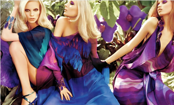
Unexpectedly interesting effects will give a combination of cyclamen with pastel versions of purple and blue.
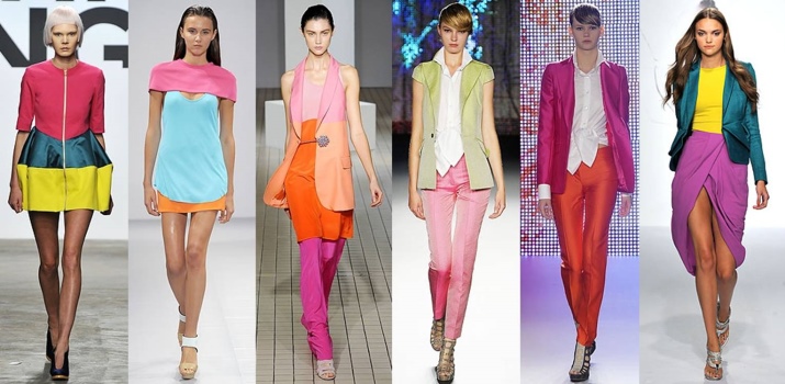
purple
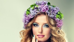
Mauve, which is a pale shade of purple, can sometimes have a reddish tint. This is a cold classic pale lilac shade, it bears a touch of tenderness and mystery inherent in early youth, it is a reflection of youth and spring.
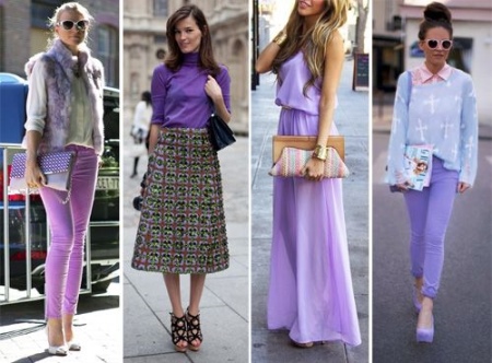
It is not able to solo the lilac color, its abundance in clothes will give the image a faded and strange look. But it is successfully combined with the same simple and natural tones: pale green, peach and brown. Decorate purple blue and blue accents.
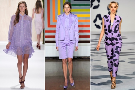
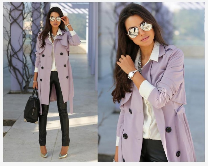
The elegance of lilac black, white, cherry, or navy is emphasized.
Aquamarine
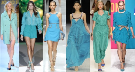
Greenish-blue, as if diluted with water, the color is called aquamarine. It is elegant and looks very elegant, gentle and self-sufficient. It gives the impression of youth, romance and freshness, characteristic of youth.
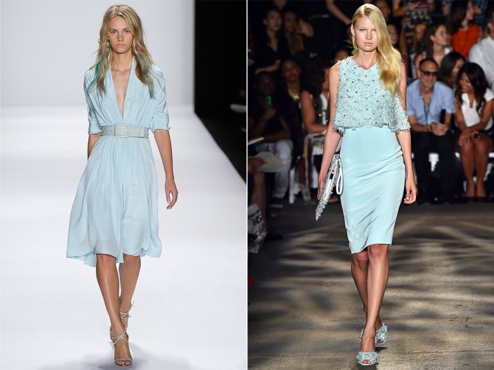
This cool color is able to decorate any evening out, but it implies the need for either a complex cut or an outfit with a spectacular finish.

A delicate combination of aquamarine with white or pale gray is suitable even for a summer office option, and will certainly be appropriate on a warm summer evening.
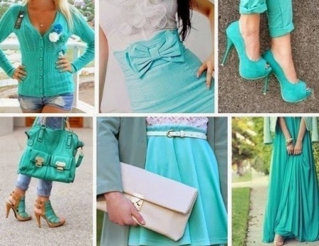
Also, aquamarine is perfectly combined with blue and cold green tones, dark blue, denim, and peach. In the youth version, its combinations with pale pink or coral are interesting.
Anthracite
This color can be called a charcoal black. You can also say that anthracite is a very dark grey. Alone, this shade will look too restrained and boring, but it can always be diluted with bright accessories or, in the case of an evening out, with jewelry.
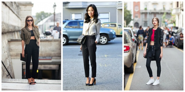
Anthracite goes well with the same neutral colors: black, white and gray. Blue will add depth to anthracite, and variations with brown tones or beige tones will emphasize its practicality.
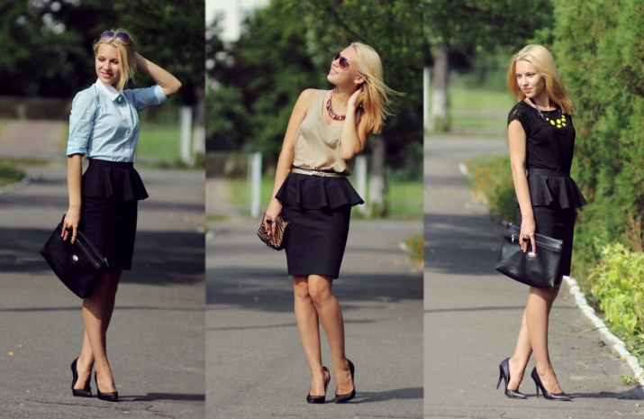
Anthracite combines well with almost all light tones and looks calm, noble and appropriate for both office and everyday wear. Mint, pink, lilac, blue or pale yellow will relieve the image of gloom and smooth out the heaviness attached to the shade of anthracite.
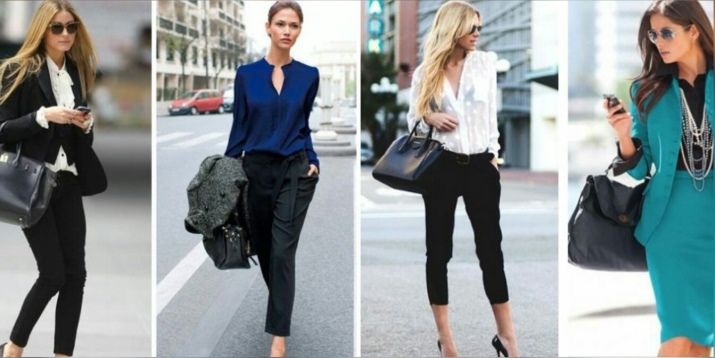
Cocoa
This is a shade of pastel light brown, close to lilac-beige, located on the border of cold and warm tones. This color is very accurately conveyed by the drink that has the corresponding name. And just like the drink of the same name, this color can have different shades depending on the concentration of brown or pink undertones.
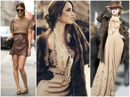
This is a very restrained and noble tone, its presence in clothes gives the appearance of confidence, restraint and calm charm. It is considered an attribute of an elegant official style, but it can also become romantically refined and make the owner cute and serious at the same time.
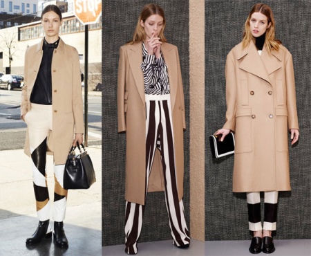
The classic combination is cocoa with white or black and chocolate tones close to it. Successfully selected wine shades, fuchsia, ruby or purple. Shades of gray, such as lilac gray or graphite, or purple tones will also be appropriate.

Graphite
It is a complex grey-black hue, often with a steely or pearly sheen, similar to the color of a simple pencil lead. This rich and noble shade is as categorical as its black counterpart, therefore it gives the impression of seriousness and formality.
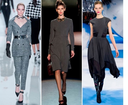
Perfectly complemented by neutral white or black, but will look bland and require bright accessories.
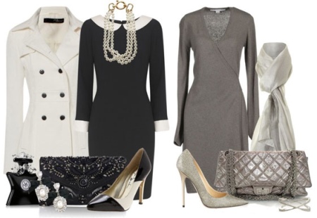
Darker graphite is very suitable for combination with turquoise, red or coral. Light graphite shades are combined with lavender, light yellow, light green, tiffany blue and rose red.
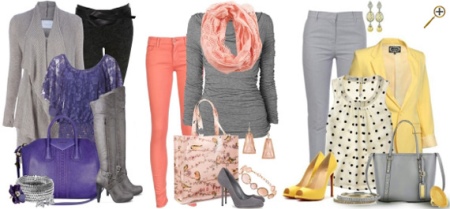
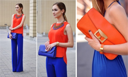
Ultramarine
This is one of the shades of blue, slightly darkened, but not at all faded. Cold and deep ultramarine gives its owner seriousness and status, and will suit both a young lady and a socialite.
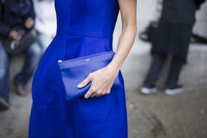
It can be a soloist, but it also looks great as a basis for a basic wardrobe.
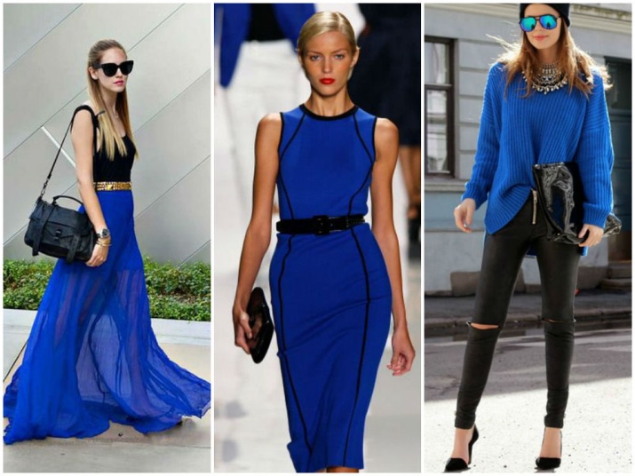
Combinations with red, orange and yellow will suit a young girl; lemon, mustard, tangerine, pumpkin shades will create a cheerful and active range in combination with ultramarine color.Sets of this shade with things of pastel or powdery tones will be more calm.
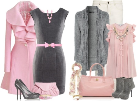
old rose
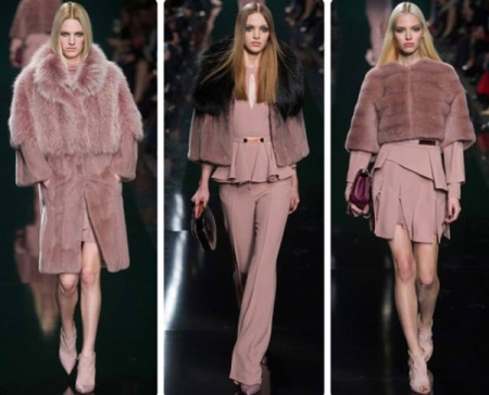
An old rose, an ashy rose, or a dusty rose are all muted pinks with lilac, beige, or grayish undertones. It is a very calm and elegant, but at the same time chic and luxurious color. It looks sophisticated and mysterious, while harmoniously combined with many shades.
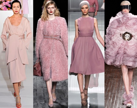
In combination with khaki or slate gray, dusty rose will give softness to the image, and together with chocolate, gray or blue, it will create a romantic mood.
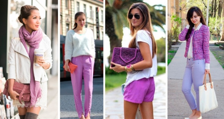
Lilac
This name combines several subtones. Pale lilac, lavender (with a predominance of blue hues), lilac (in which pink drowns out blue tones) - all this is lilac.
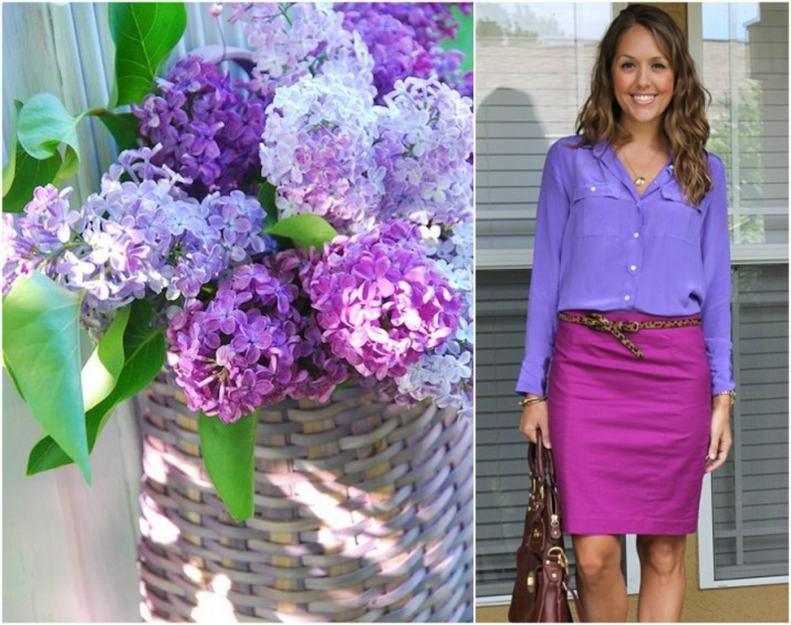
This color is chosen by creative women, smart and sensual. Thanks to the sophistication of the lilac color, they manage to create non-trivial and mysterious images. Lilac has a strong internal energy, so it is good in solo variations.
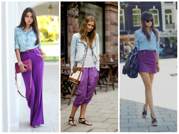
But, if desired, you can combine it with green, brownish-beige and white.
Smoky
A beautiful shade of gray with an admixture of a bluish undertone is called a smoky color. It is associated with modesty, decency, adherence to principles and diligence. In general, a woman who knows how to wear things of this shade invariably makes an intelligent impression.
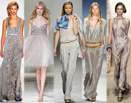
Smoky, like its fellow gray, is the basis for a basic wardrobe, as it comes with almost all known shades.
Birch
A complex mix of white and black, which has some resemblance to the pattern on the bark of a birch, is commonly called a birch shade. It attracts attention with its unusualness and evokes associations with purity and innocence.This is a universal color, it suits blondes, brunettes, and redheads.
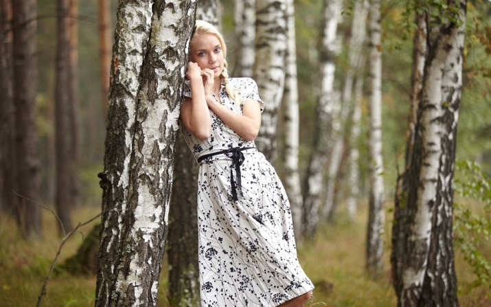
Perfectly shaded with black and white, combined with pastel colors, or with muted dark ones. A bright orange or red accessory will refresh and decorate a thing made of birch-colored fabric.
Orchid
This is a juicy and rich version of pink with purple notes, very feminine, delicate and delicate. He will give the owner brightness and charm, she will not look catchy, but will never go unnoticed.
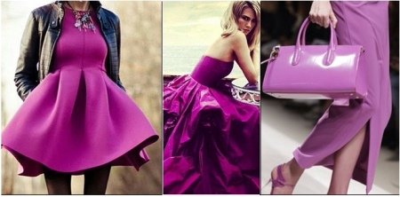
This shade will look great in a cocktail or evening dress, but can also decorate an office suit or casual wear.
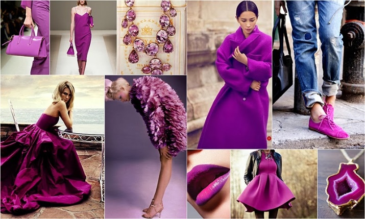
Most successfully combined with pastel and powdery tones, denim, pale blue or dark blue.
Plum
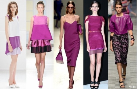
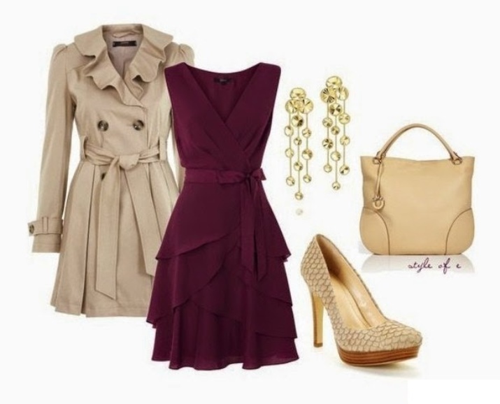
Two sophisticated hues, purple and burgundy, mix to form a plum color, named after the hint of a ripe plum. This is a warm tone, rich and thick, it looks mysterious and mysterious. A woman dressed in plum looks majestic, romantic or exciting, depending on the depth of the shade, which can range from dark plum to close to lavender.
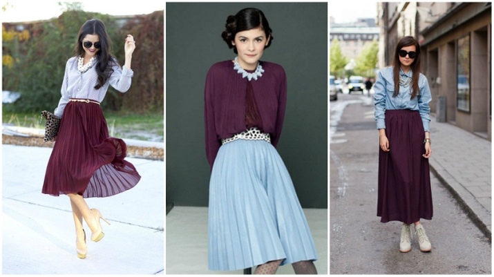
Light plum will give the owner romance and airiness, dark ones will show her spirituality and nobility. But in any case, he will demonstrate her courage and self-confidence. However, it is desirable to dilute this shade, avoiding congestion.
Plum is combined with basic black, white and gray. Looks great in combination with milky, beige-brown, chocolate, blue, as well as pink, lilac and red.
ecru
So the French call the shade of unbleached silk or linen.This is a very close to beige pale brownish-gray tone, belonging to the luxury class, precisely because of the association with natural aristocratic fabrics, historically available only to the upper class.
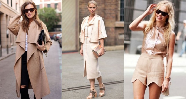
Accordingly, this is how a woman dressed in ecru is perceived, she is always restrained and elegant. This shade is preferred by balanced, calm and dreamy natures, somewhat old-fashioned in relationships.
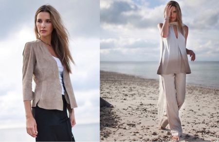
This color is typical for wedding fashion, evening dresses and business style, and is also good for summer things.
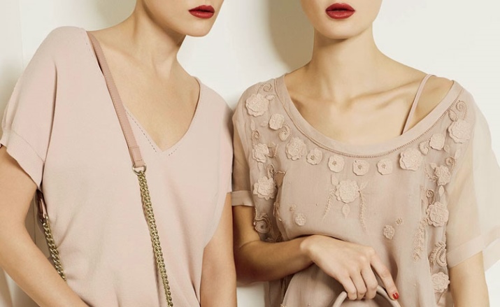
This shade is very convenient to combine with a brown palette close to it, but it will also look advantageous with cherry-red tones.
How to choose the right color for you
All the numerous variety of human appearance is divided into four main color types: Winter and Summer, which are classified as cold color types; Spring and Autumn are considered warm types.
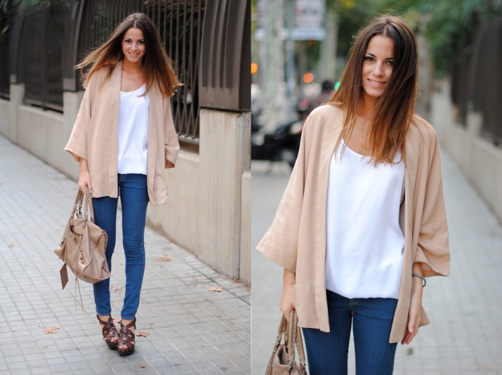
Such a division has absolutely nothing to do with the date of birth, and is not calculated according to the horoscope. The division by color type is suitable for both brunettes and blondes and redheads.
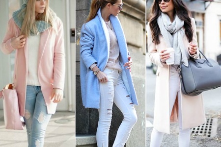
To determine your color type, you need to use one of the methods based on visual testing. Usually they compare the effect of pink and peach shades of fabric on appearance. If pink tones help to decorate the appearance, then this is a cold color type, if peach tones are warm.
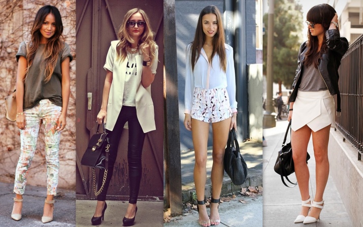
Inside, subtypes are divided according to the same principle: gray-pink muted shades will suit Summer, and bright pink ones - Winter.
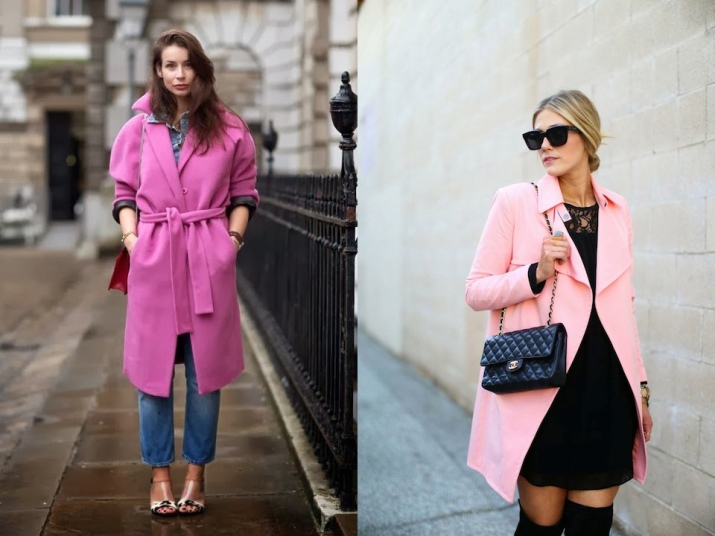
A peach warm, muted color close to orange will emphasize the Autumn color type, and a bright warm color will emphasize Spring.
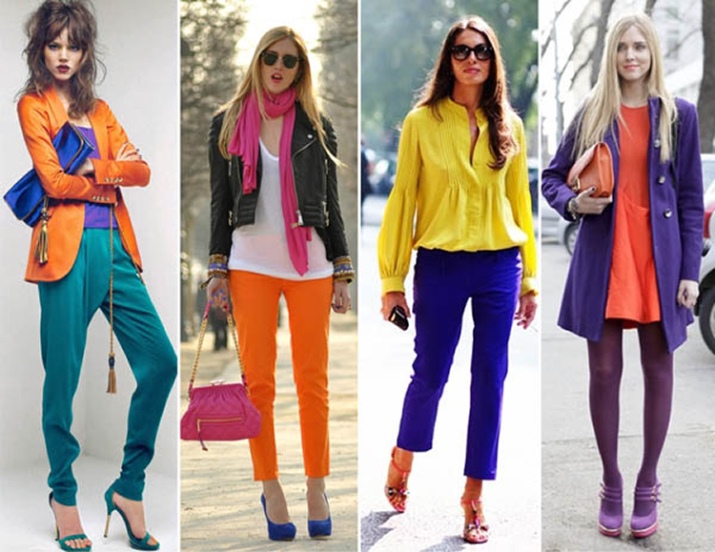
In accordance with the color type, it is worth completing your wardrobe.
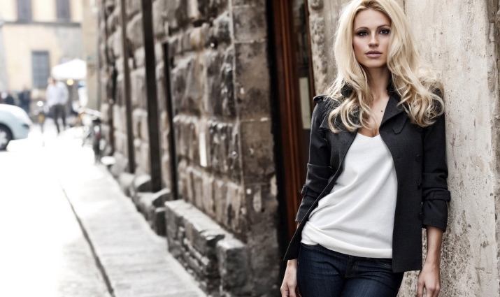
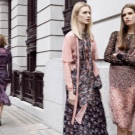

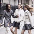
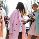
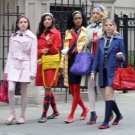
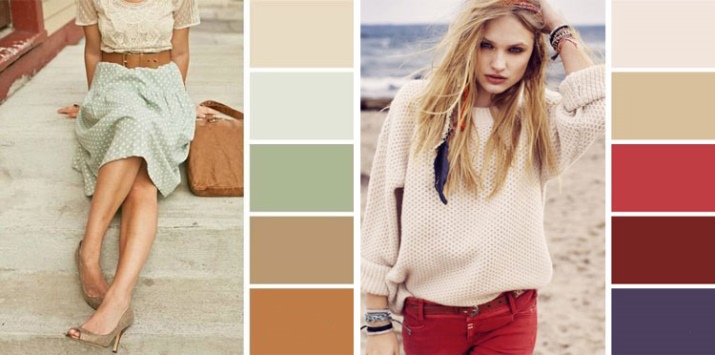
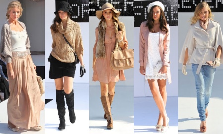
Natural warm colors are suitable for Spring Woman.These are cream, mustard, ecru, caramel, light beige. Orange-red, peach and, interestingly, lilac and soft light blue tones.
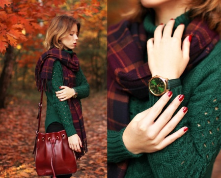
Woman-Autumn will emphasize her beauty with outfits of muted shades, close to natural: shades of the earth, foliage or tree bark. These are coffee, red, brown, green, pear, swamp, coral.
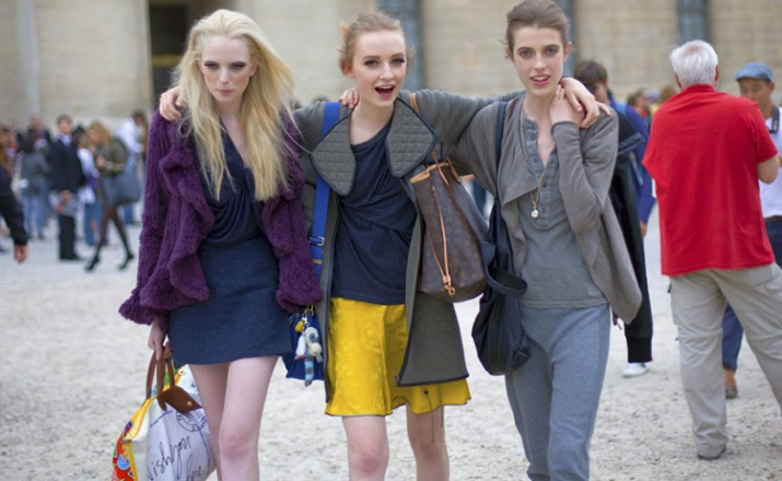
Winter Woman should use colors that are cold and bright. These are blue and pink shades, gray, purple and blue. Neutral colors like black and white are perfect.
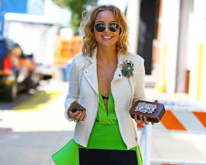
Woman-Summer will look good in muted blue, turquoise, light green, burgundy, raspberry.
Compatibility
Entire dissertations have been written about the compatibility and compatibility of colors in clothes, designers have compiled complex tables of color compatibility with each other. All of these tips can be summarized in a few recommendations:
- When compiling a set, it is worth using from two to four colors, a larger number of shades is undesirable, as it breaks the visual impression;
- You can combine only those colors that turn out to be either related to each other or contrasting, other options are unacceptable, because they will look inharmonious;
- Related colors include colors that differ in hue, and absolutely opposite colors are called contrasting; You can find out about this using the color wheel;
- All pastel colors can be combined with each other;
- It is necessary to take into account your individual color type and select shades in accordance with it;
- When creating monochrome sets, especially for full ladies, you should carefully use pink, which can visually add excessive volume.
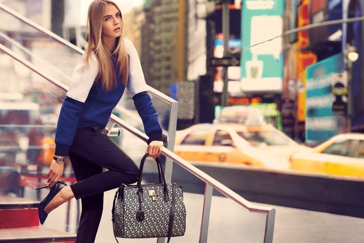


Stylish images
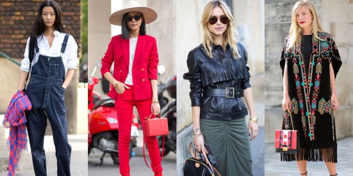
Color can be used to improve or cool the attitude of others towards its wearer. Using color options, you can create an atmosphere of elegance, warmth and tranquility, or convey a mood of enthusiasm and youth. Color can be the most powerful element in your wardrobe if you learn how to use it effectively.



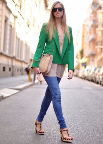
For example, to create a light and airy mood on a summer morning, a combination of three shades will help: blue jeans, a bright green jacket and an airy powder-colored chiffon blouse.
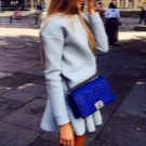
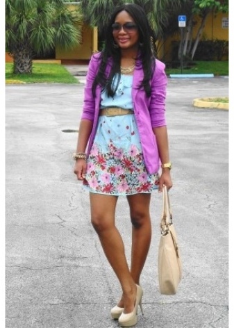
Tropical breeze and holiday mood emanates from another summer set: a pale blue dress with a floral print along the hem sets off a bright lightweight cyclamen-colored cardigan. The image is complemented by a noble pastel shade of ecru, from which shoes and a handbag are made.
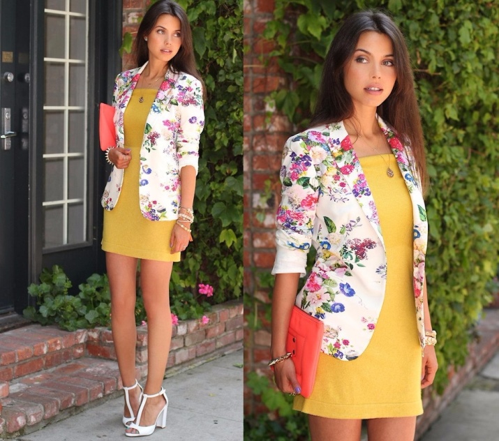
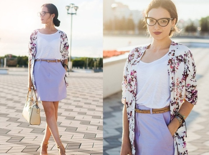
An option that is suitable for an informal meeting on a hot day, combining a serious and frivolous summer mood: a bright mustard-colored dress adorns a milky jacket with a pattern of delicate summer flowers, lilacs and petunias. The look is completed with milky high-heeled sandals and light metal jewelry.
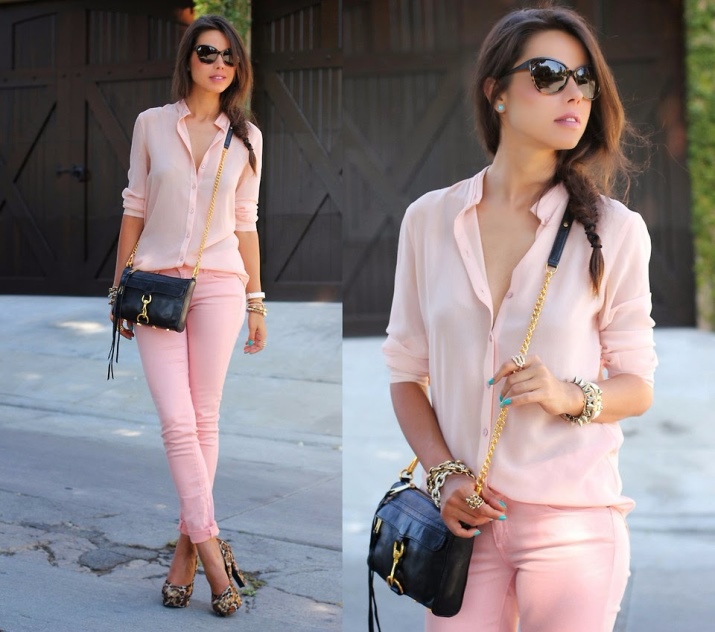
For a shopping trip, a friendly meeting, or even a date, it is appropriate to wear light trousers in a pale pinkish-peach shade and a soft pink silk blouse. A playful mood in this pastel look will be created by shoes with high, more than 10 cm, heels, decorated with leopard print, a black handbag on a chain and the presence of jewelry in an informal style.
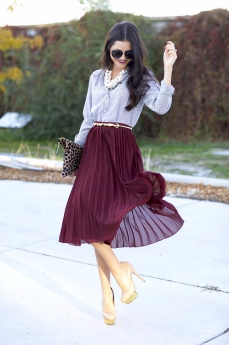
For the modest, a set of plum-colored pleated chiffon skirt, decorated with a thin golden belt and combined with an equally light blouse of a complex blue and white pattern, will seem interesting.
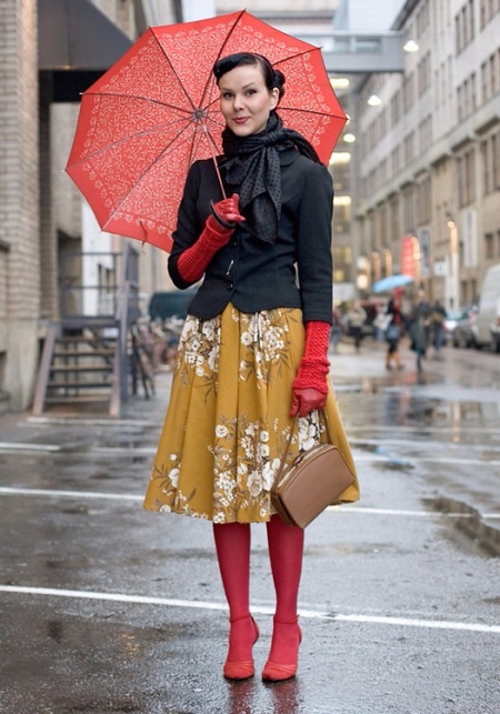
Warm summer rain is no reason to abandon an elegant outfit.It is worth decorating a gloomy day with bright notes of a coral-red outfit, and the mood will instantly improve! A mustard-colored dress is perfectly combined not only with a coral umbrella, but also with tights, gloves and shoes of the same joyful color. A short anthracite-black jacket, complemented by a neckerchief, will add a touch of seriousness. A beige handbag completes the look.
A well-chosen color combination of an outfit allows a woman not only to feel more confident, but also inspires new experiments, revealing the talent for color perception in each of us.







Thank you.